Vivino Quick Scan | From shelf to glass: guiding users to the perfect bottle

Vivino Quick Scan | From shelf to glass: guiding users to the perfect bottle

60% increase in user engagement, +12% scan accuracy, and drove ~50% of all new Premium subscriptions.

Role

Lead Product Designer

Platform

iOS & Android App

Timeline

2022 - 2023
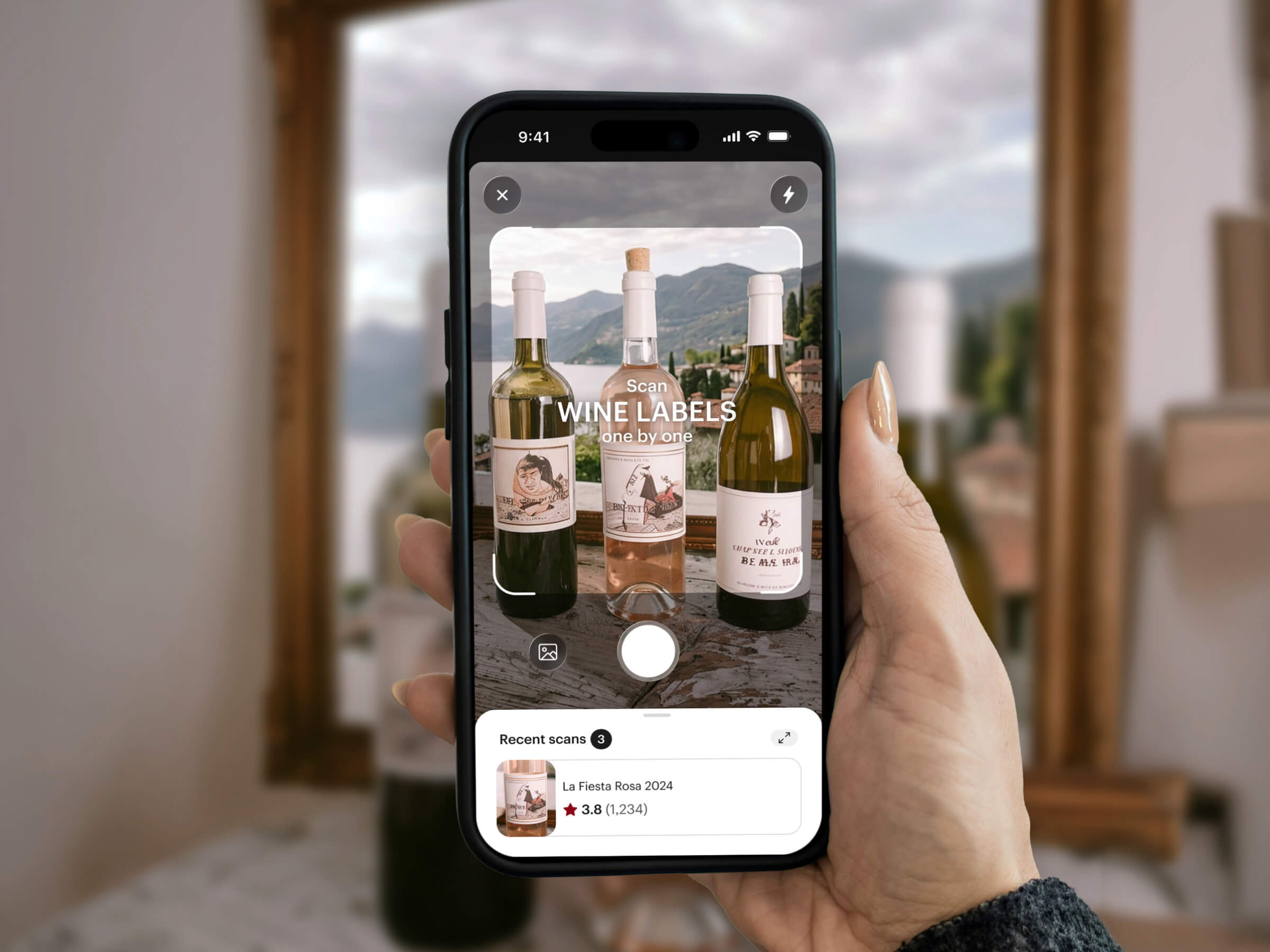
Compare feature mockup

TL;DR

Redesigned Vivino’s core scanner and introduced a frictionless Multi-Scan feature, transforming a frustrating utility into the company’s top monetization engine.

Fixed the Core Loop: Replaced a broken UI with contextual user guidance, boosting the match rate from 82% to ~91%.

Deepened Engagement: The intuitive Multi-Scan bottom sheet caused scans per session to jump by 60%.

Massive Revenue Impact: The feature proved so powerful it was gated for Premium users, successfully driving ~50% of all new paid subscriptions.

The Problem

Phase 1

Fixing the Broken Engine

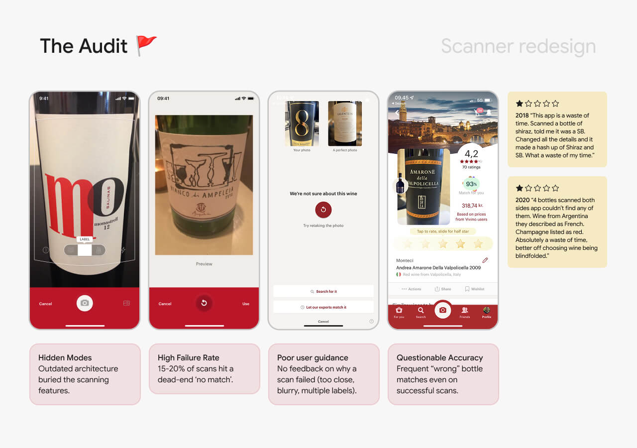
The redesign started as a dual mandate: the business needed to bring the tech in-house, and UX needed to fix a leaky funnel.

15–20% of scans hit a "no match" dead end.

Mismatches created a "bad data spiral" where users reviewed the wrong wines.
The Approach & Solution

Designing Within Reality

Working in parallel tracks with engineering and research, we hit hard constraints early. We couldn't use AR, and our first UX theories failed in testing:

✺ Failed: Full Bottle Scan. Forced users to step back awkwardly. It broke their mental model. Killed.

✺ Failed: Auto-Capture. Felt jarring and unexpected. Users wanted to be in control. Killed.

✺ Failed: Upfront Onboarding. Dismissed in 4 out of 5 tests. Users don’t read manuals. Killed.


The Winning Pivot

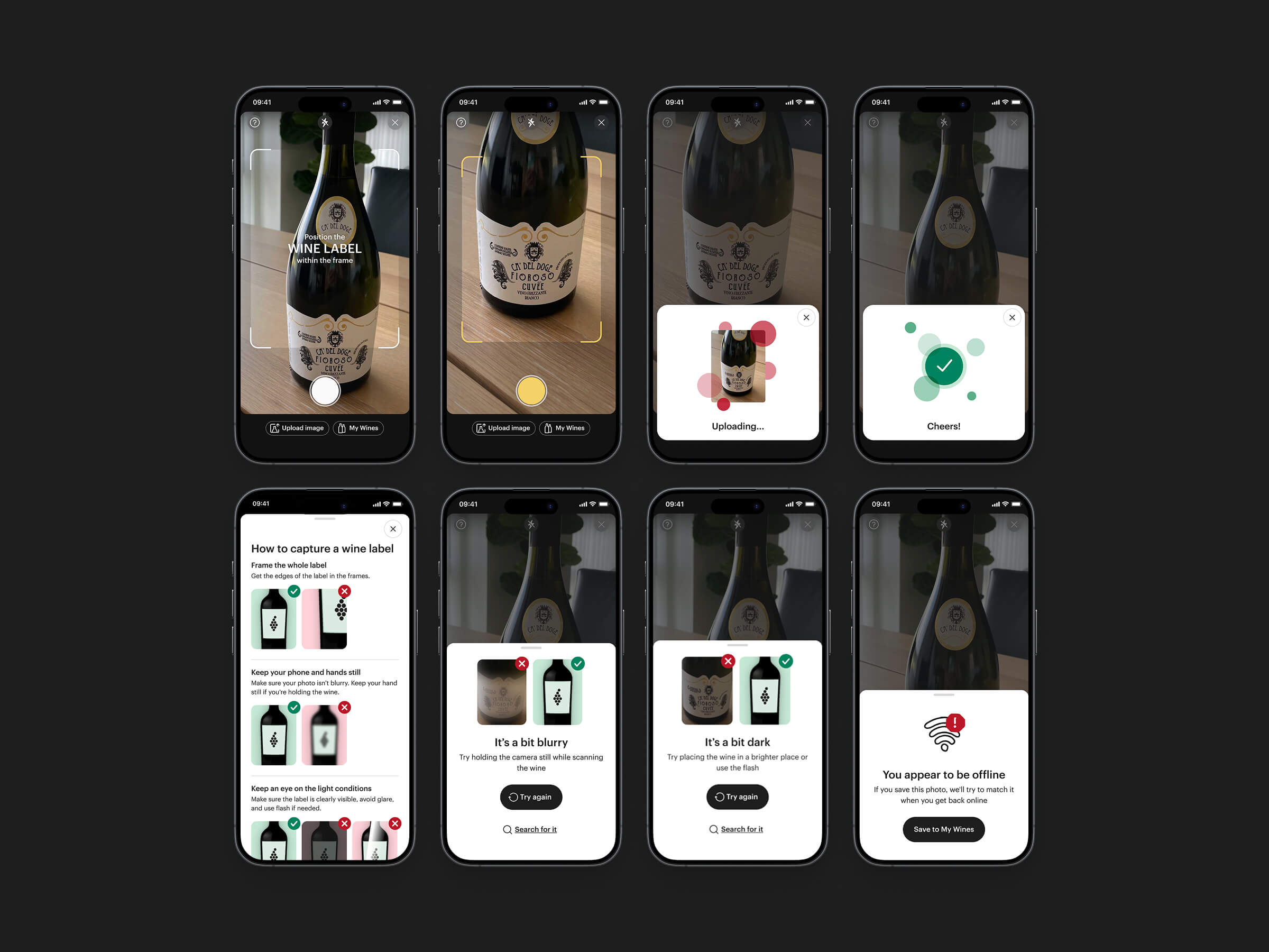
We stopped trying to teach users a "Vivino UI" and leaned into familiar native camera patterns. We introduced real-time haptic feedback to physically guide the shot, and contextual bottom sheets that instantly explained why a scan failed (too dark, blurry, off-center) instead of hiding behind a generic error code.

The Problem

Phase 2

Unlocking the Multi-Scan

With the single-scan engine finally humming, we immediately tackled our biggest user opportunity: the "Value Seeker." Users standing in a supermarket don't want to scan one bottle; they want to scan fifty and find the best one.

The Goal: Drive deeper engagement by bumping average scans per session from 1.5 to 3+.

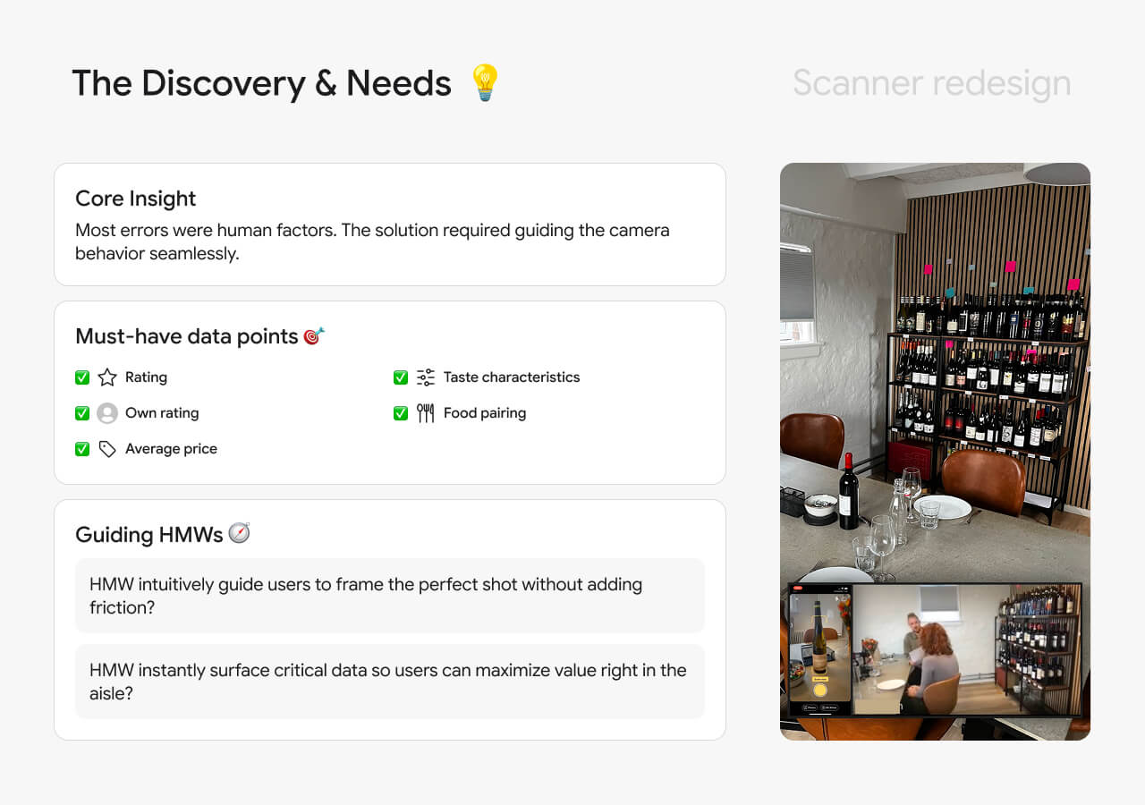
The Exploration: We ran unmoderated tests and card-sorting to figure out exactly what data users needed to compare wines at a glance. We tested two flows:

✺ Modal: Tapping a button to stay in the camera after each scan.

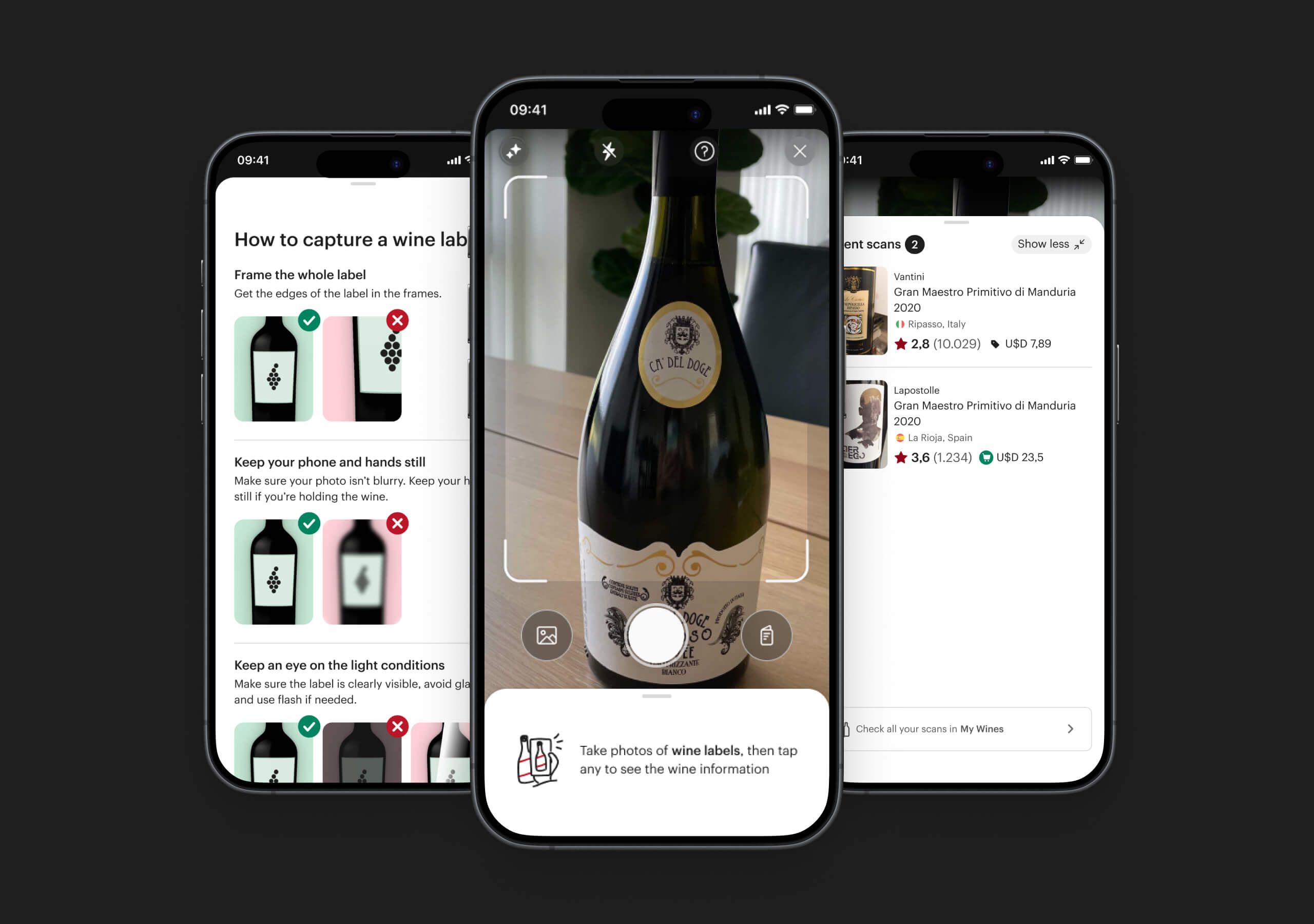
✺ Modeless: Keeping the user in the camera view seamlessly, quietly storing scans in a bottom sheet.


The Breakthrough

The modeless experience was a massive hit. In our final usability labs, it was pure magic to watch users intuitively understand the flow. Without a single hint, they scanned three bottles, swiped up the bottom sheet, compared the essential data points side-by-side, tapped the "highest rated," and transitioned to product detail pages. We had a validated, frictionless winner.

The Approach

Designing Within Reality

Working in parallel tracks with engineering and research, we hit hard constraints early. We couldn't use AR, and our first UX theories failed in testing:

✺ Failed: Full Bottle Scan. Forced users to step back awkwardly. It broke their mental model. Killed.

✺ Failed: Auto-Capture. Felt jarring and unexpected. Users wanted to be in control. Killed.

✺ Failed: Upfront Onboarding. Dismissed in 4 out of 5 tests. Users don’t read manuals. Killed.


The Winning Pivot

We stopped trying to teach users a "Vivino UI" and leaned into familiar native camera patterns. We introduced real-time haptic feedback to physically guide the shot, and contextual bottom sheets that instantly explained why a scan failed (too dark, blurry, off-center) instead of hiding behind a generic error code.

The Impact

✺ +60% Engagement: The frictionless, modeless bottom sheet caused scans per session to jump from 2.5 to 4.

✺ +12% Accuracy: The improved coaching UI led to a massive increase in correct vintage and wine detection.

✺ The Ultimate Business Win: Because this continuous scanning experience proved so powerful, it became the company's top acquisition driver, ultimately accounting for ~50% of all new Premium subscriptions.


The Plot Twist

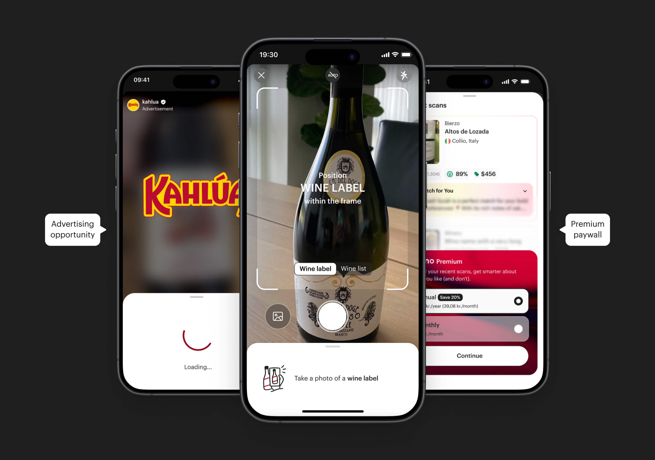
Just as we validated this frictionless Multi-Scan experience, the business stepped in with a curveball. The feature was so good at solving the user's core problem that leadership identified it as a massive monetization lever.

Having successfully built the foundation and validated the flow, I collaborated on the initial paywall strategy before handing this high-value feature over to a dedicated monetization squad for launch.

It was the ultimate compliment to our UX: we built something so valuable, people were willing to pay for it.

usability lab

The Impact

✺ +60% Engagement: The frictionless, modeless bottom sheet caused scans per session to jump from 2.5 to 4.

✺ +12% Accuracy: The improved coaching UI led to a massive increase in correct vintage and wine detection.

✺ The Ultimate Business Win: Because this continuous scanning experience proved so powerful, it became the company's top acquisition driver, ultimately accounting for ~50% of all new Premium subscriptions.


The Plot Twist

Just as we validated this frictionless Multi-Scan experience, the business stepped in with a curveball. The feature was so good at solving the user's core problem that leadership identified it as a massive monetization lever.

Having successfully built the foundation and validated the flow, I collaborated on the initial paywall strategy before handing this high-value feature over to a dedicated monetization squad for launch.

It was the ultimate compliment to our UX: we built something so valuable, people were willing to pay for it.

The Approach

Designing Within Reality

Working in parallel tracks with engineering and research, we hit hard constraints early. We couldn't use AR, and our first UX theories failed in testing:

✺ Failed: Full Bottle Scan. Forced users to step back awkwardly. It broke their mental model. Killed.

✺ Failed: Auto-Capture. Felt jarring and unexpected. Users wanted to be in control. Killed.

✺ Failed: Upfront Onboarding. Dismissed in 4 out of 5 tests. Users don’t read manuals. Killed.


The Winning Pivot

We stopped trying to teach users a "Vivino UI" and leaned into familiar native camera patterns. We introduced real-time haptic feedback to physically guide the shot, and contextual bottom sheets that instantly explained why a scan failed (too dark, blurry, off-center) instead of hiding behind a generic error code.